SPRING RETREAT 2019 BRANDING
With the theme of the retreat already defined, I got inspired by the outdoor location of the retreat and decided to go for a simple and clean look. I implemented the logo on stickers, digital flyers, social media info, and a mobile PDF event program which people could download.
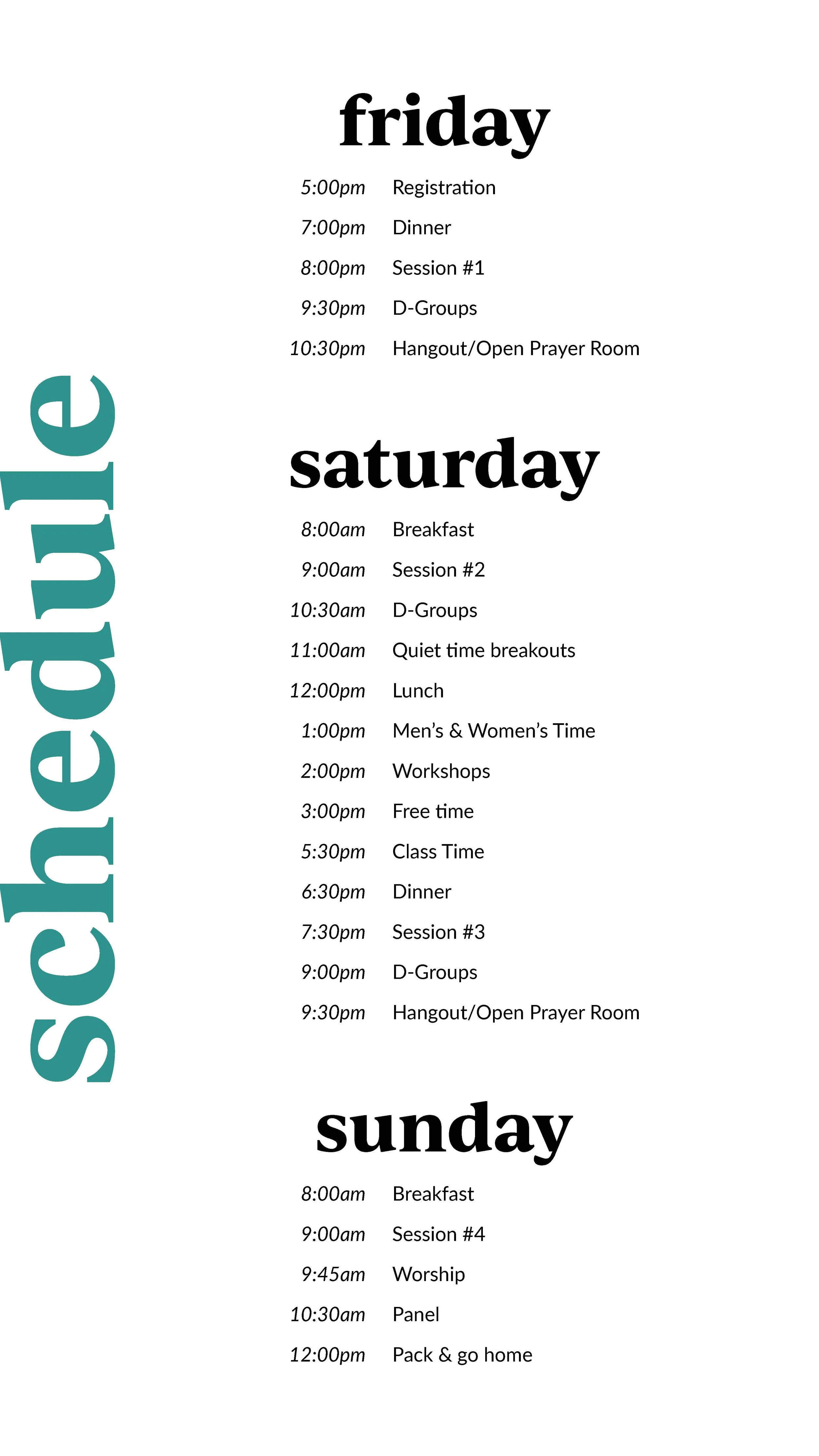
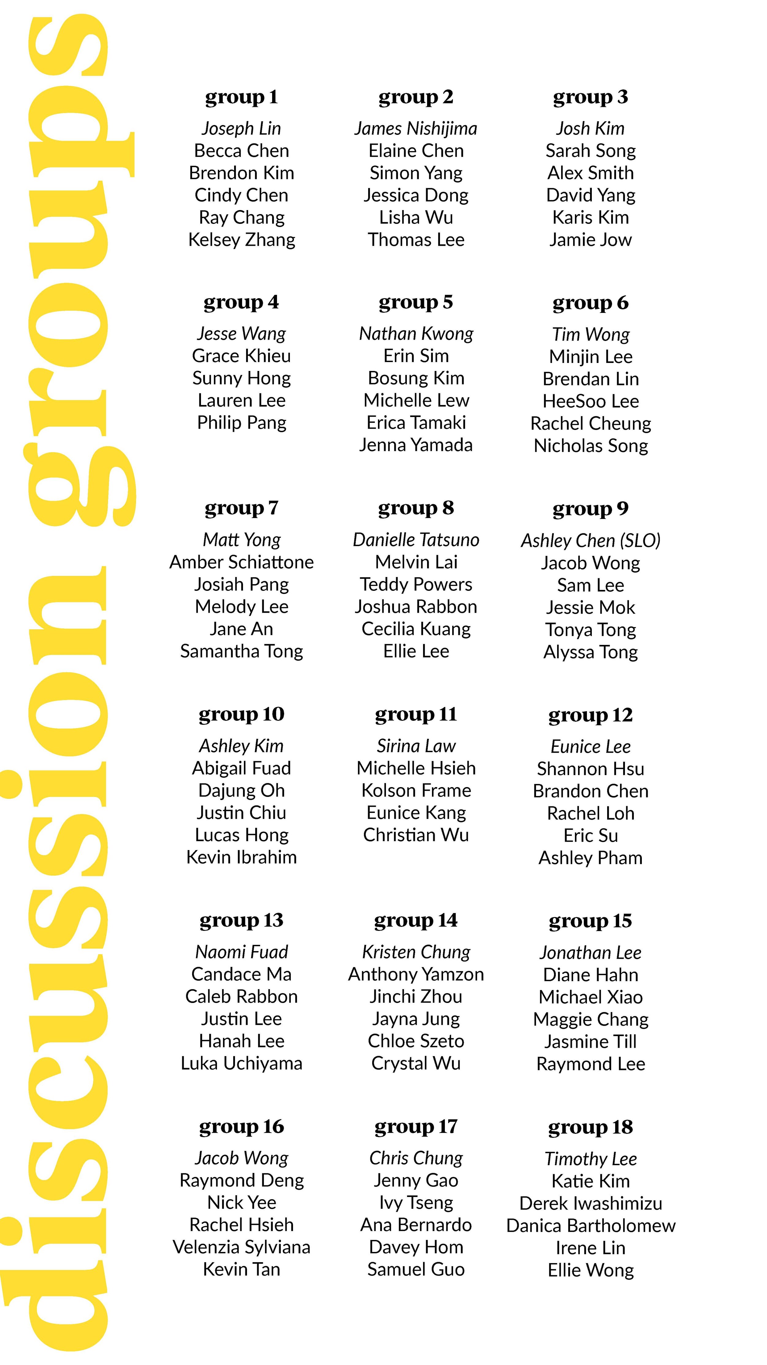
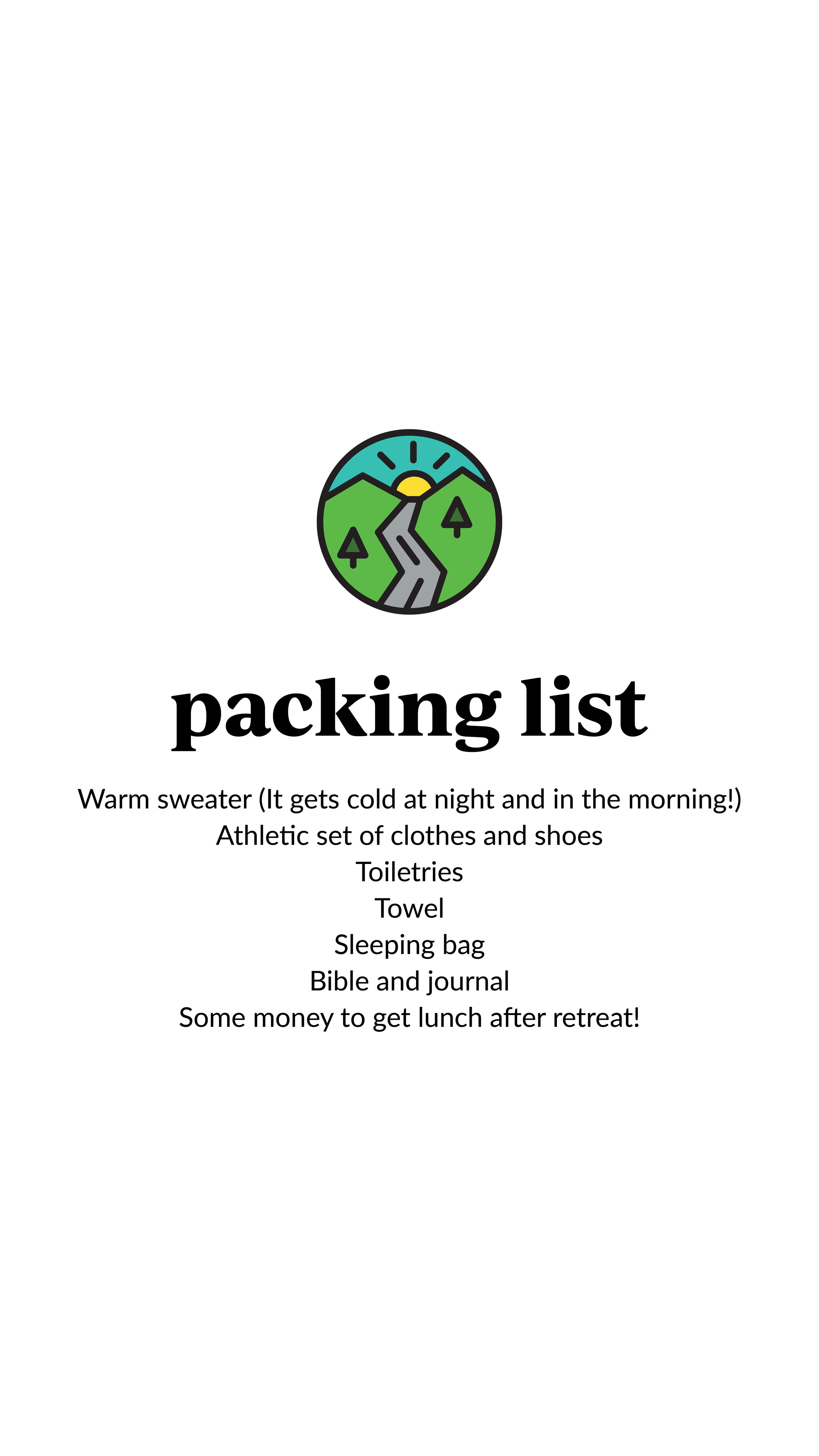
The event program required fitting large bodies of text onto a small screen, so utilizing clean fonts and spacing helped me make the text more readable. The stickers were also small, so creating a graphic and using fonts that were scalable was important to the user experience.
I used 6 main colors with IvyJournal Bold for the headers and variations of Lato for the subheaders and body.


